Anyone. Anytime. Anywhere.
~
Anyone. Anytime. Anywhere. ~
PROJECT
The year Peloton reset its identity
BRAND
Peloton
YEAR
2023
ROLE
Associate Creative Director
CHALLENGE
By 2023, Peloton was at an inflection point. A new leadership brought a clear mandate: reposition the brand to broaden appeal, highlight the full ecosystem — particularly the App — and connect with younger, more digitally native audiences. The brand had evolved through leadership changes, but this marked the first true visual and strategic reset. We needed to move beyond the Bike, refresh the identity, shift the colour system and tone, and make Peloton feel more inclusive, accessible and culturally current.
APPROACH
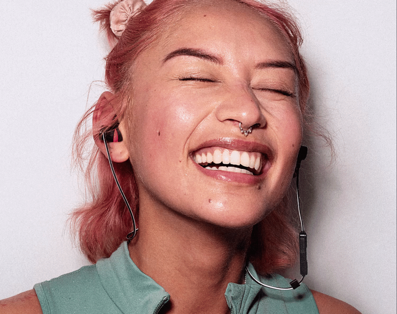
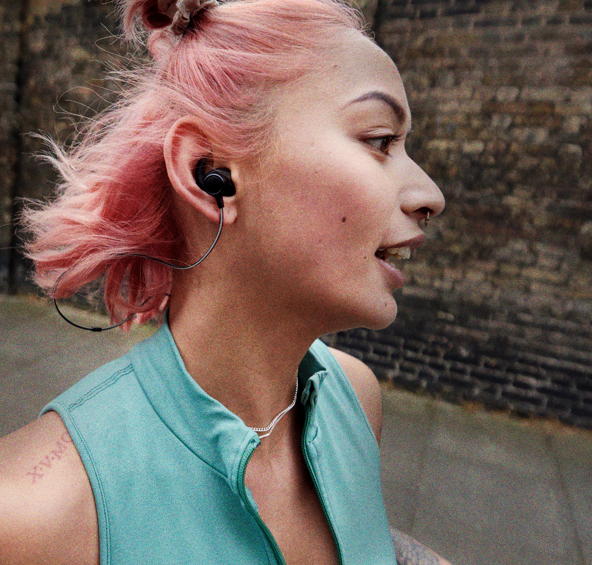
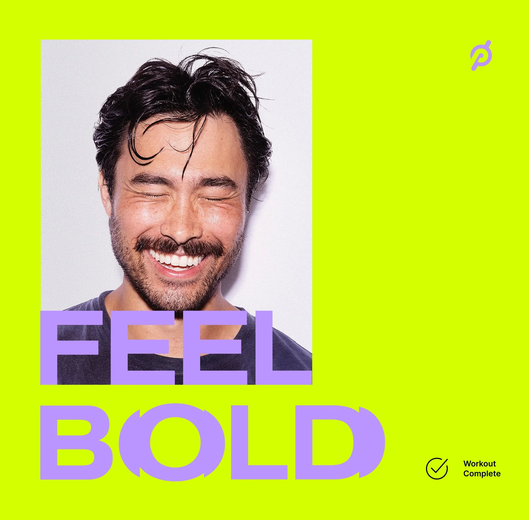
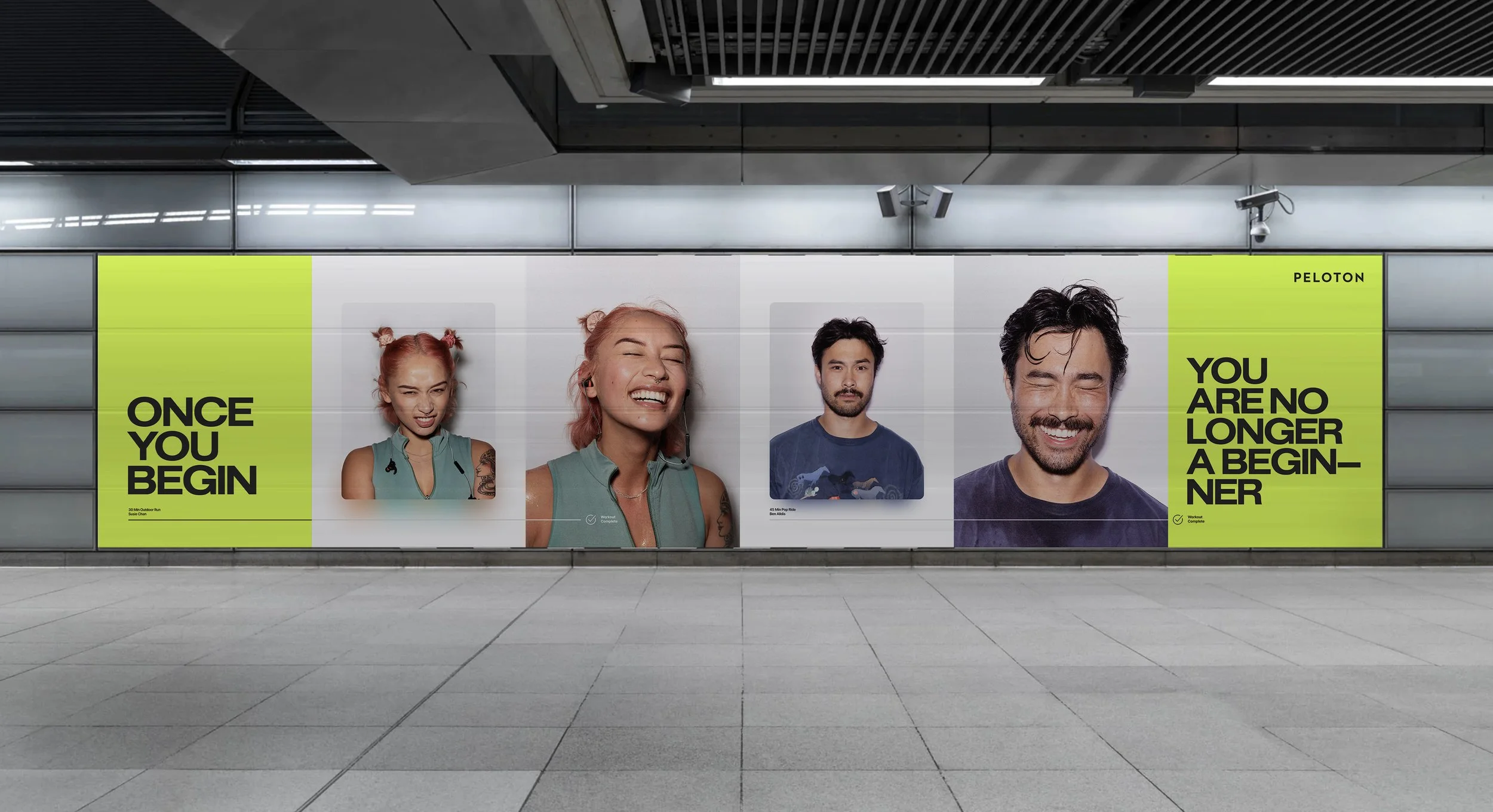
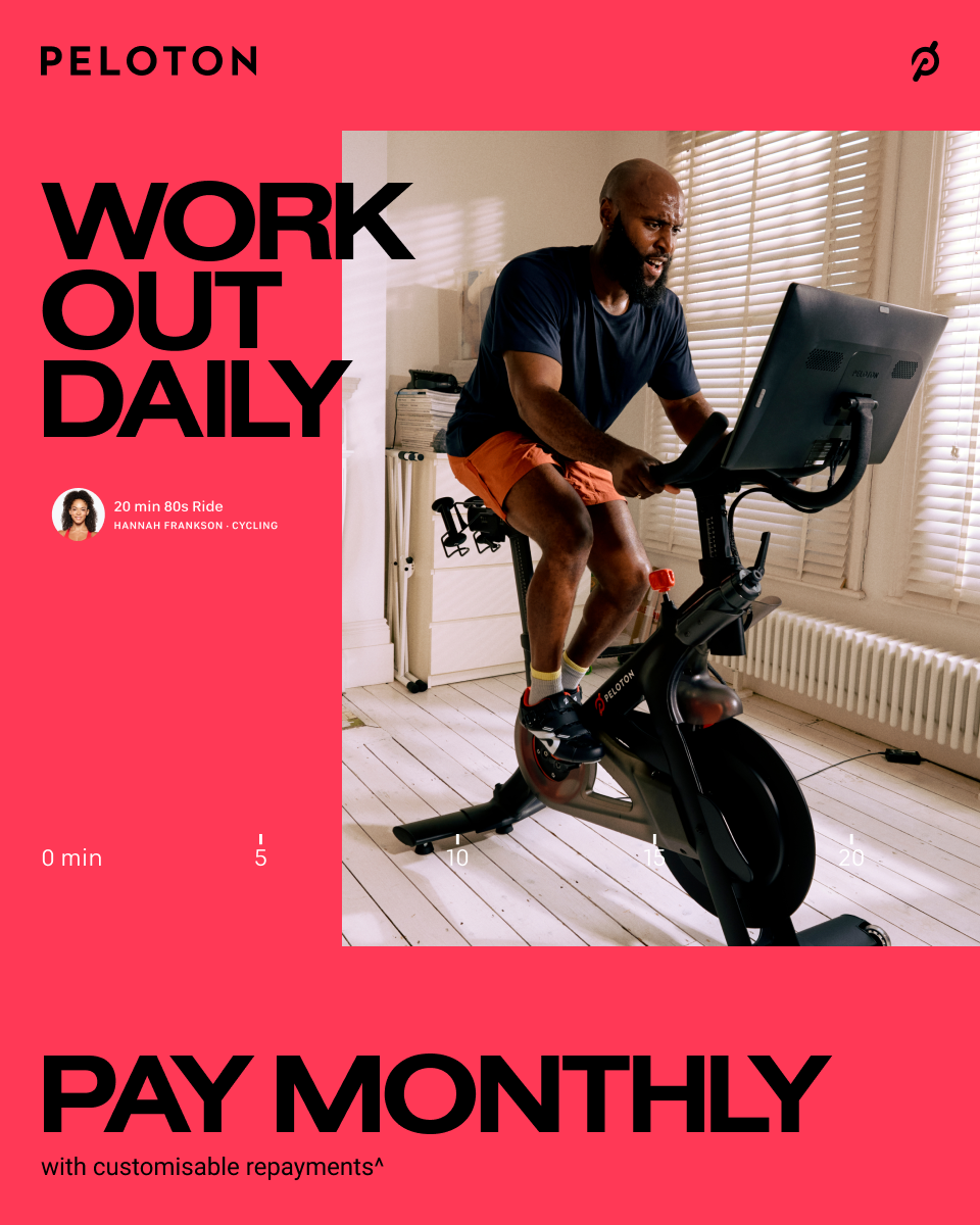
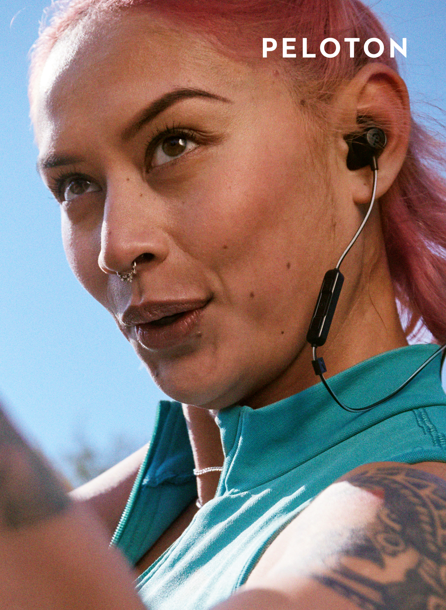
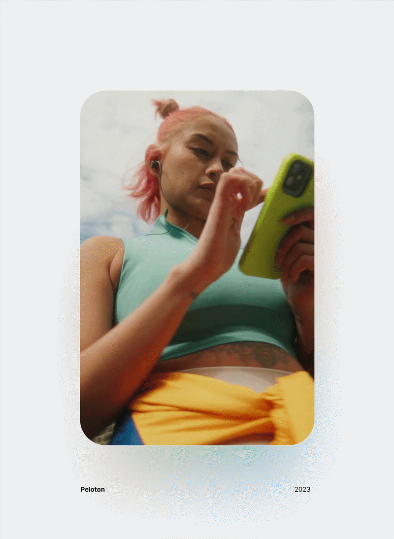
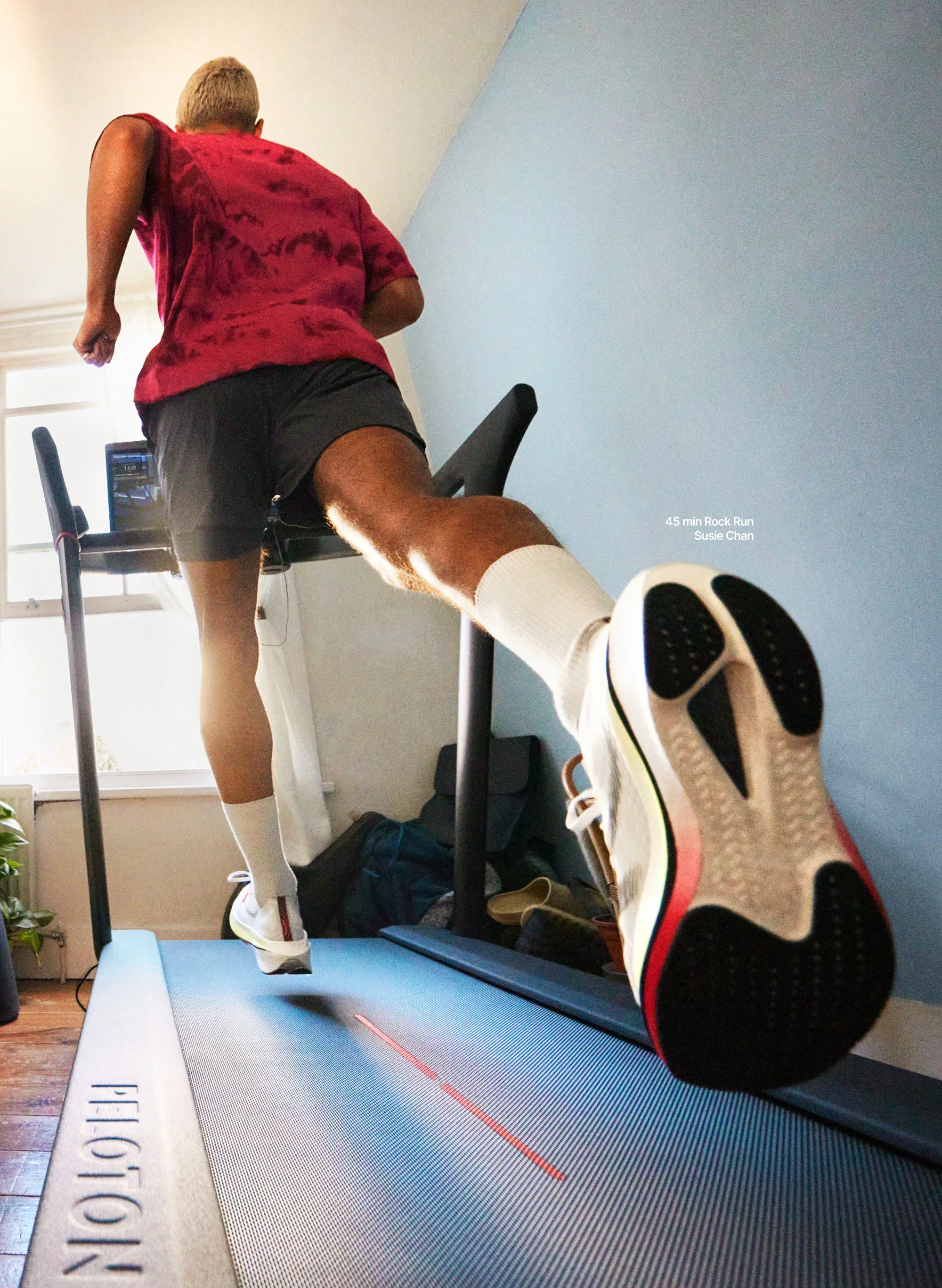
We embraced the reset fully. Instead of polished aspirational fitness imagery, we turned the camera toward real members — in their own homes, in their real routines. We used their names, their stories and their before-and-after workout moments to create a system rooted in relatability.
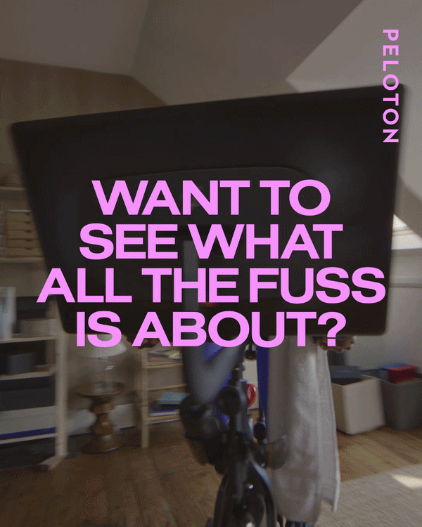
The campaign lived under Anyone. Anytime. Anywhere., reframing Peloton as more than equipment — as an ecosystem that fits every lifestyle.
I led the creative direction of this transformation shoot — hand-selecting members, interviewing them, building a comprehensive capture matrix to ensure every touchpoint was covered. Across London and LA, we produced video and more than 150 stills, ultimately generating over 3,000 assets to support the brand reset globally.
The Brand System
A full visual identity was rebuilt by our partnership with Mother Design and our in-house team. We worked closely with Mother on the foundational system — colour, typography, logo behaviour, principles — and then led the translation in-house, evolving and applying it across every surface the brand touched.
Content was captured to power the website, retail, lifecycle, paid social, organic, OOH, in-studio displays and internal communications. Instructors and employees joined the activation, extending the system into a living series. Every asset laddered back to the new identity — colour, typography, casting, messaging and platform integration.
The result was a cohesive rollout of the new Peloton across every consumer touchpoint.
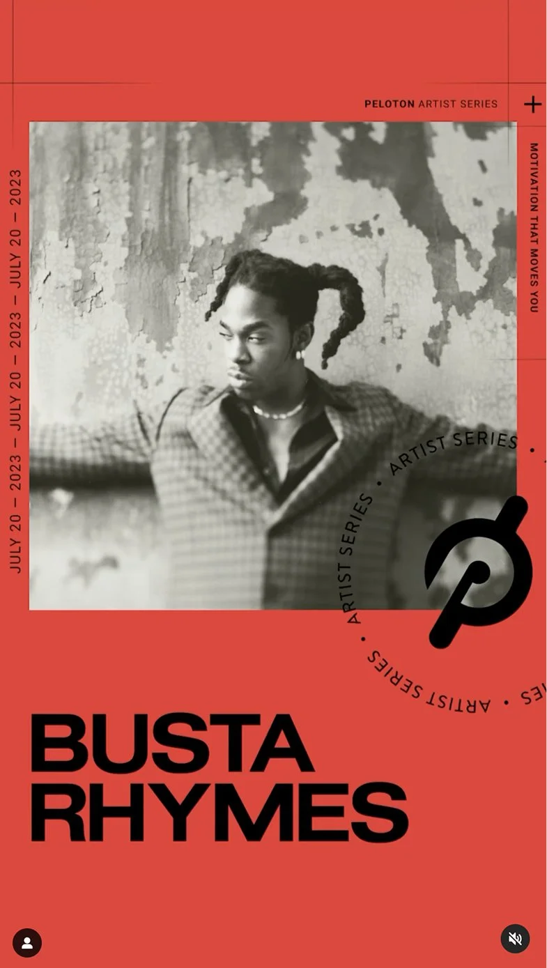
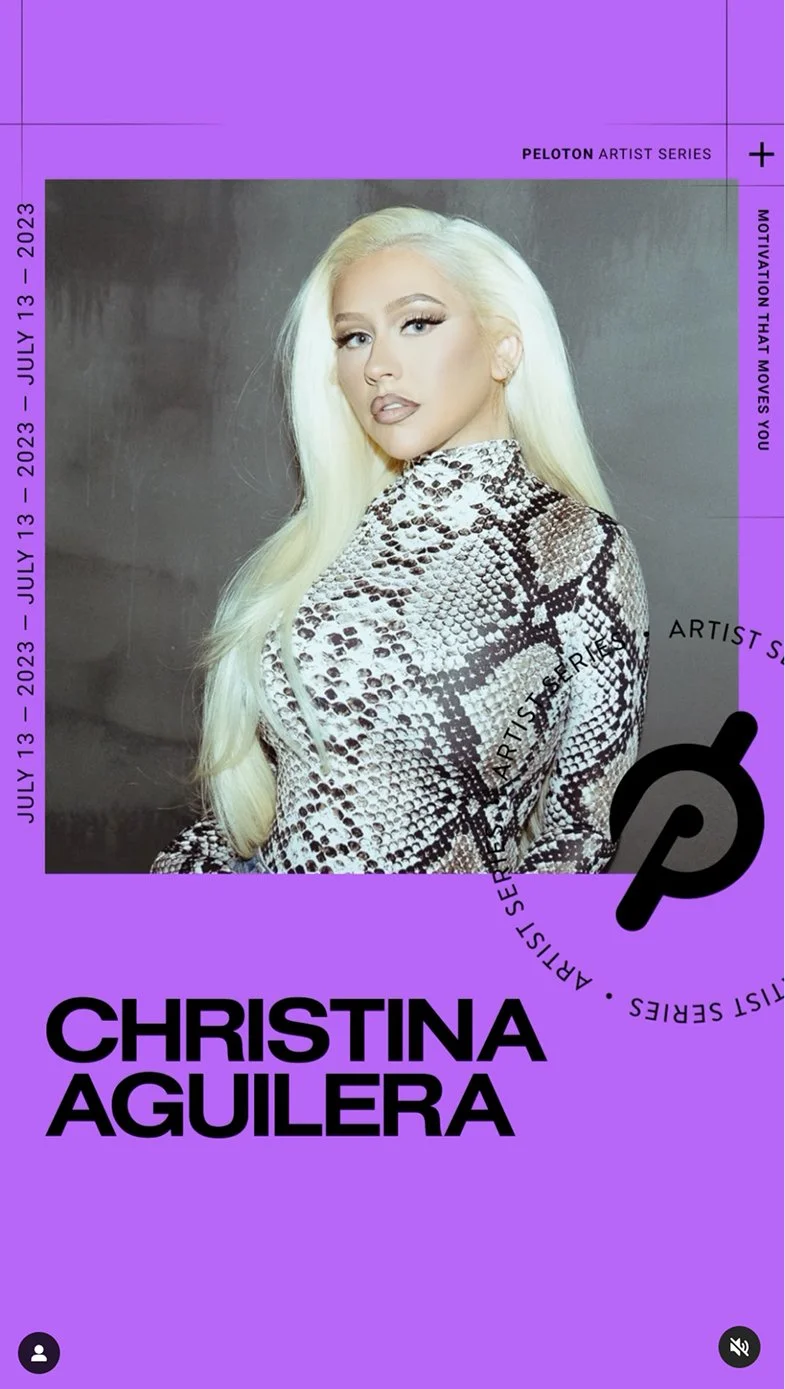
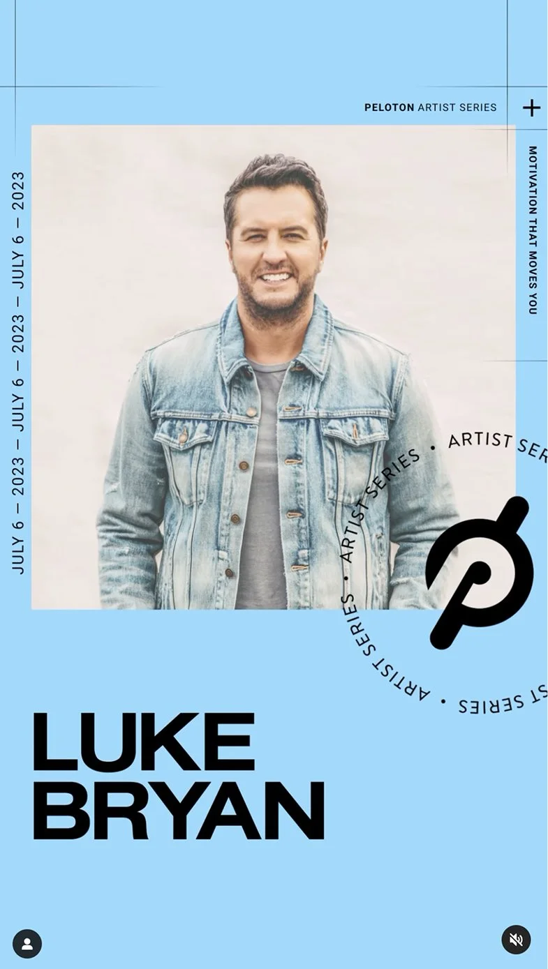
Artist Series Classes
Presentations
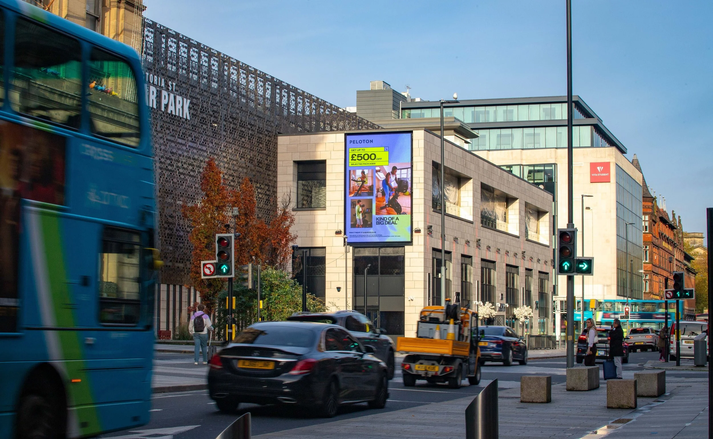
OOH
Lifecycle
Product
Hardware Banner

The system flexed into performance ads too, where each execution carried a different RTB tied to a specific discipline. We built a framework that kept the visual identity consistent while letting the content shift — cycling, strength, yoga, running, each with its own examples, tone and message — so the work stayed coherent at scale even as the stories underneath changed.
Performance Ad — Content Education
Performance Ad — Discipline Education
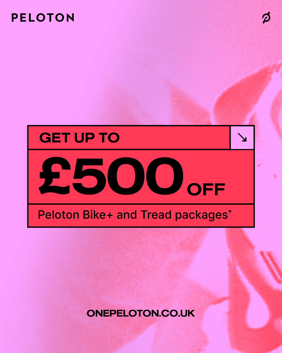
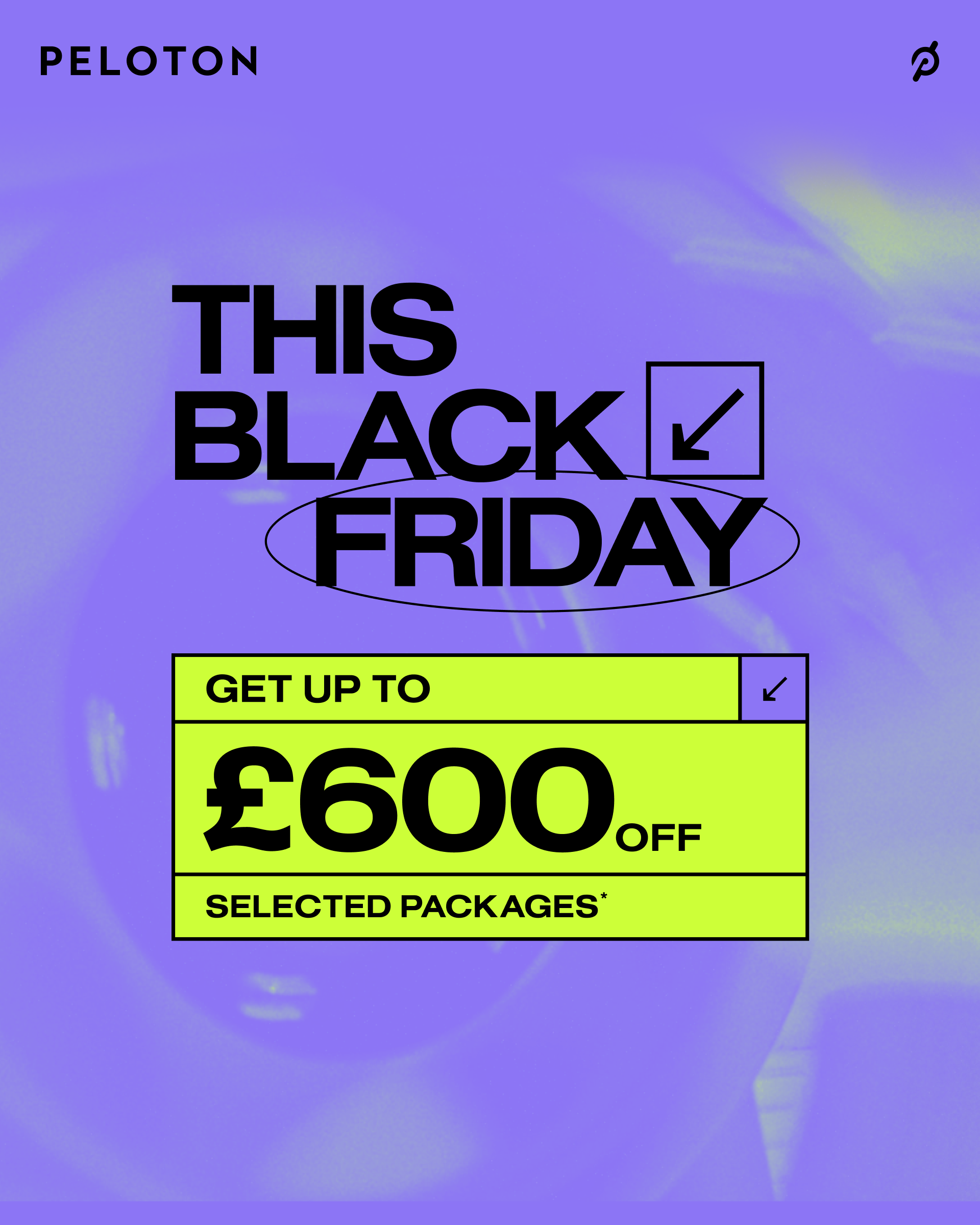
The Holiday season promo and activation followed the same systems logic, with a variation of the visual identity and new colours layered into the palette. This was a deliberate choice: rather than release the full colour system at launch, we phased it across seasons — giving the brand room to settle into its new identity, and giving each calendar moment its own distinct energy.
Promo / Education Paid Media
OOH Holiday Promo
Paid Media — Holiday 30 Days RTB
Impact
Over 3,000 assets produced across London and LA
Real members featured by name, increasing relatability and emotional resonance
Strong positive community response as members saw themselves reflected in national advertising
Subsequent leadership changes and new product launches have continued to refine the brand’s positioning, including more recent pivots in demographic focus.
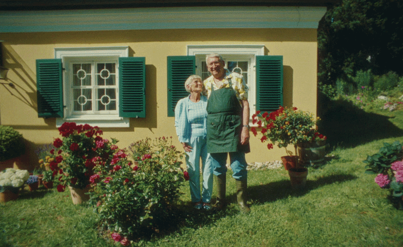
Peloton
The secret to a marvellous life
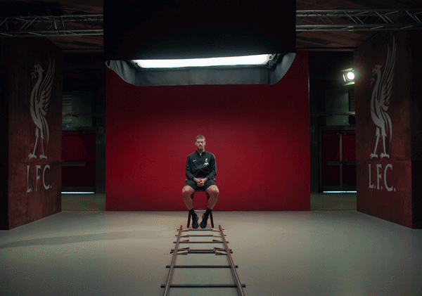
Peloton x Liverpool
Goals. Anytime. Anywhere.
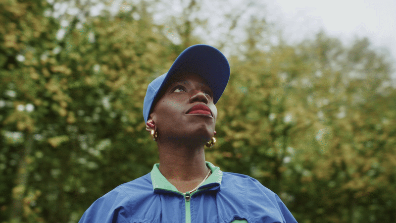
Peloton
Moved by discipline: Candice Brathwaite
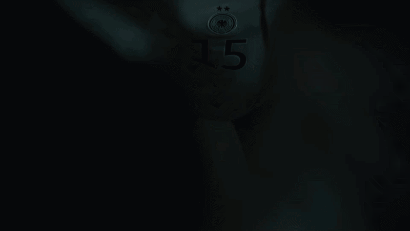
Peloton x German National League
Ever loved something so much?