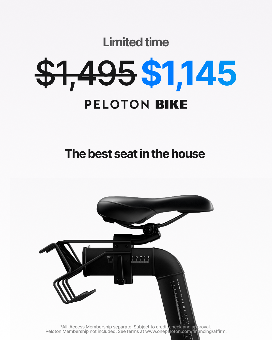
Peloton's Biggest Promo
~
Peloton's Biggest Promo ~
PROJECT
Lower funnel creative
BRAND
Peloton
YEAR
2025
ROLE
Associate Creative Director
CHALLENGE
Promotional creative is usually where craft goes to die. The brief, the discount, the deadline. For Peloton's biggest global sale across five markets (UK, US, Canada, Germany and Australia), we wanted to change that. The challenge was to build a design system that was genuinely visual and animation-led, flexible enough to scale across channels, markets and RTBs, and ambitious enough to start signalling a new direction for the brand. Performance without sacrificing craft. Scale without losing coherence.
APPROACH
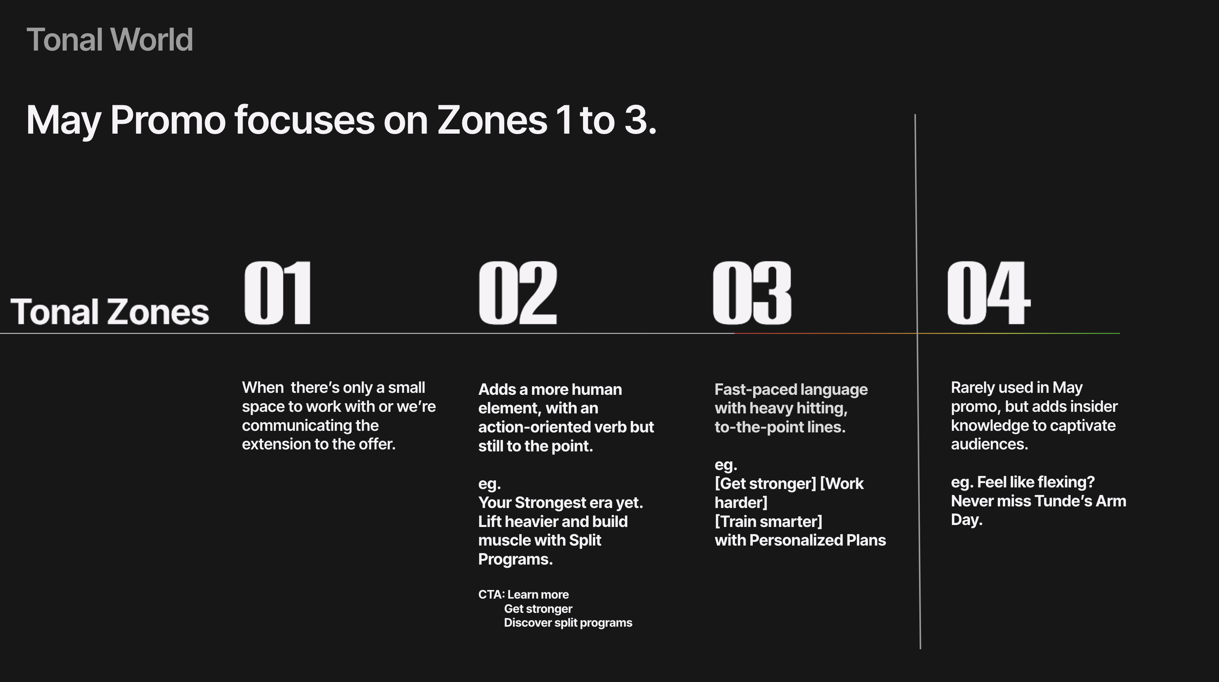
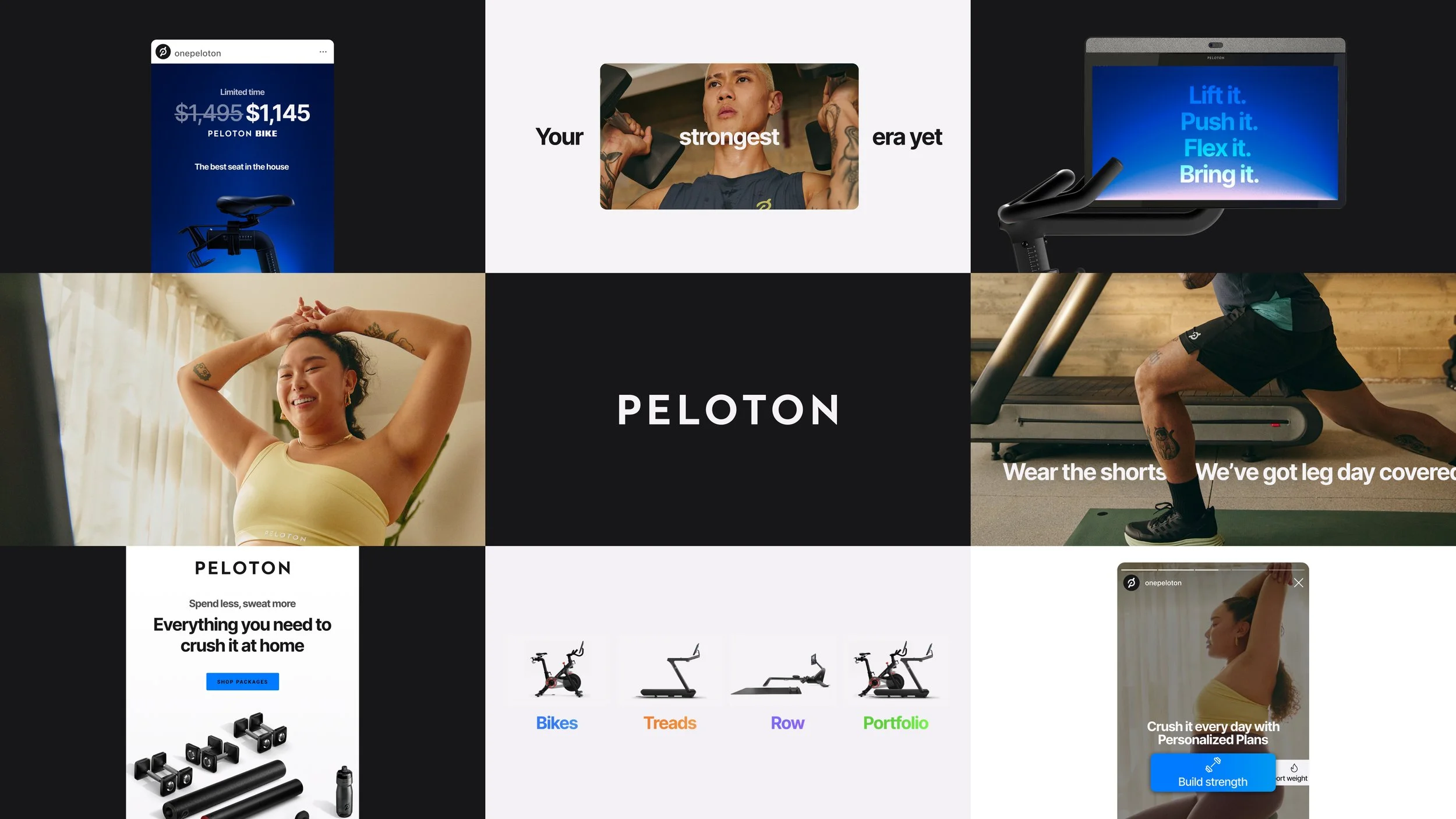
We approached it as a system build, not an asset delivery. A colour strategy and visual identity framework came first, stress-tested across OLV, web, digital media, retail and paid social. Animation was central from the start, with a specific approach to deconstructing Peloton's app UI and reintegrating it into campaign assets, both on photography and reverse on footage.
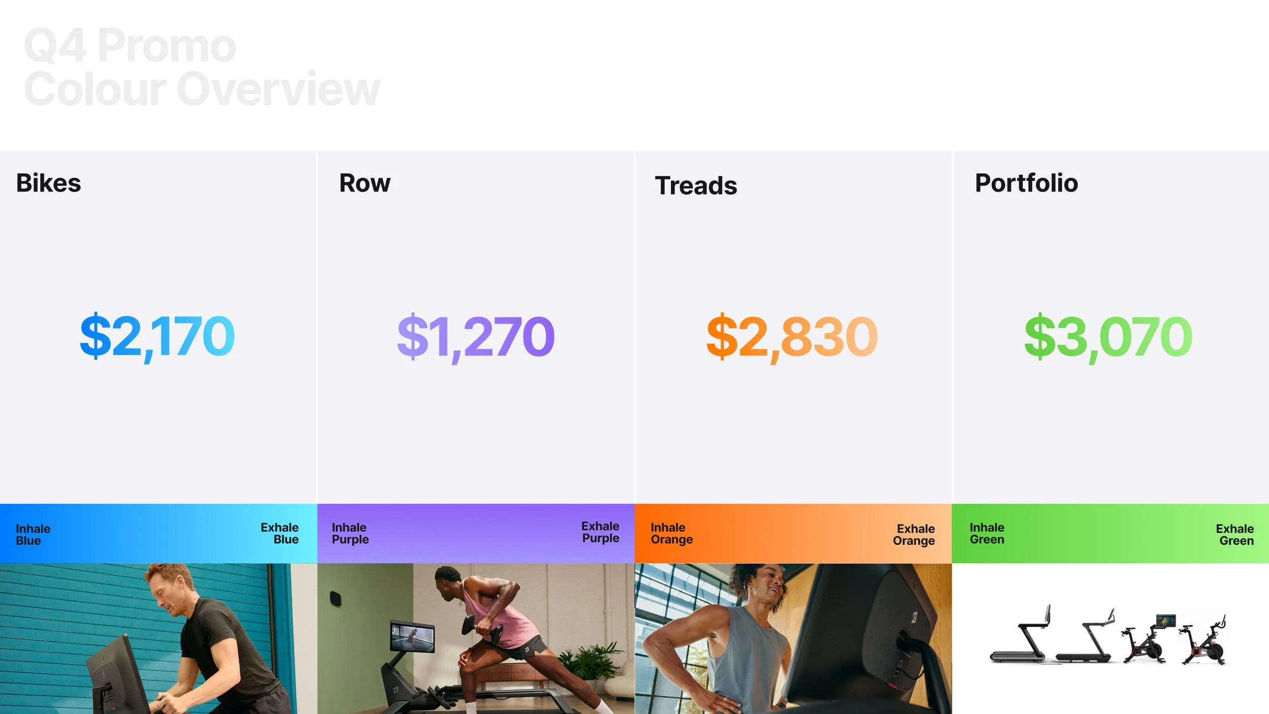
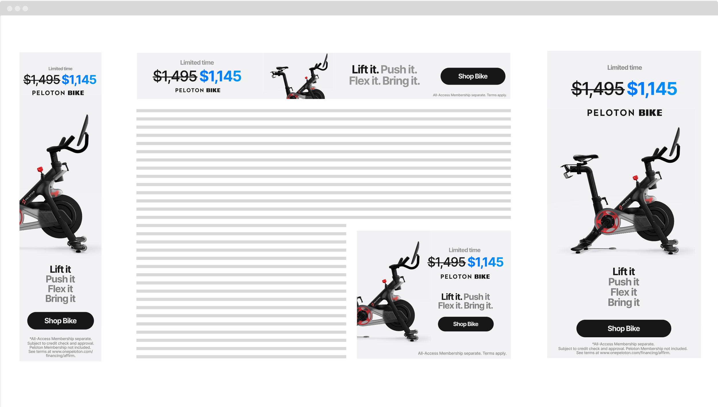
Every element was designed to flex across five markets: RTB-specific lock-ups, promo treatments, member testimonials, instructor quotes and product typography each had their own visual logic, then came together inside Storyteq templates built for scale and speed. The result was a fully modular system with multiple variants per message, internationally adaptable and channel-specific where it needed to be.
The sale surpassed expectations. More than that, this was the first time Peloton used a promo moment to start shifting the brand's visual direction, and the system we built became part of the foundation for what came next.
Promo Framework

US OLV 15s


A/B Test Urgency Message — A

B — +34% CTR
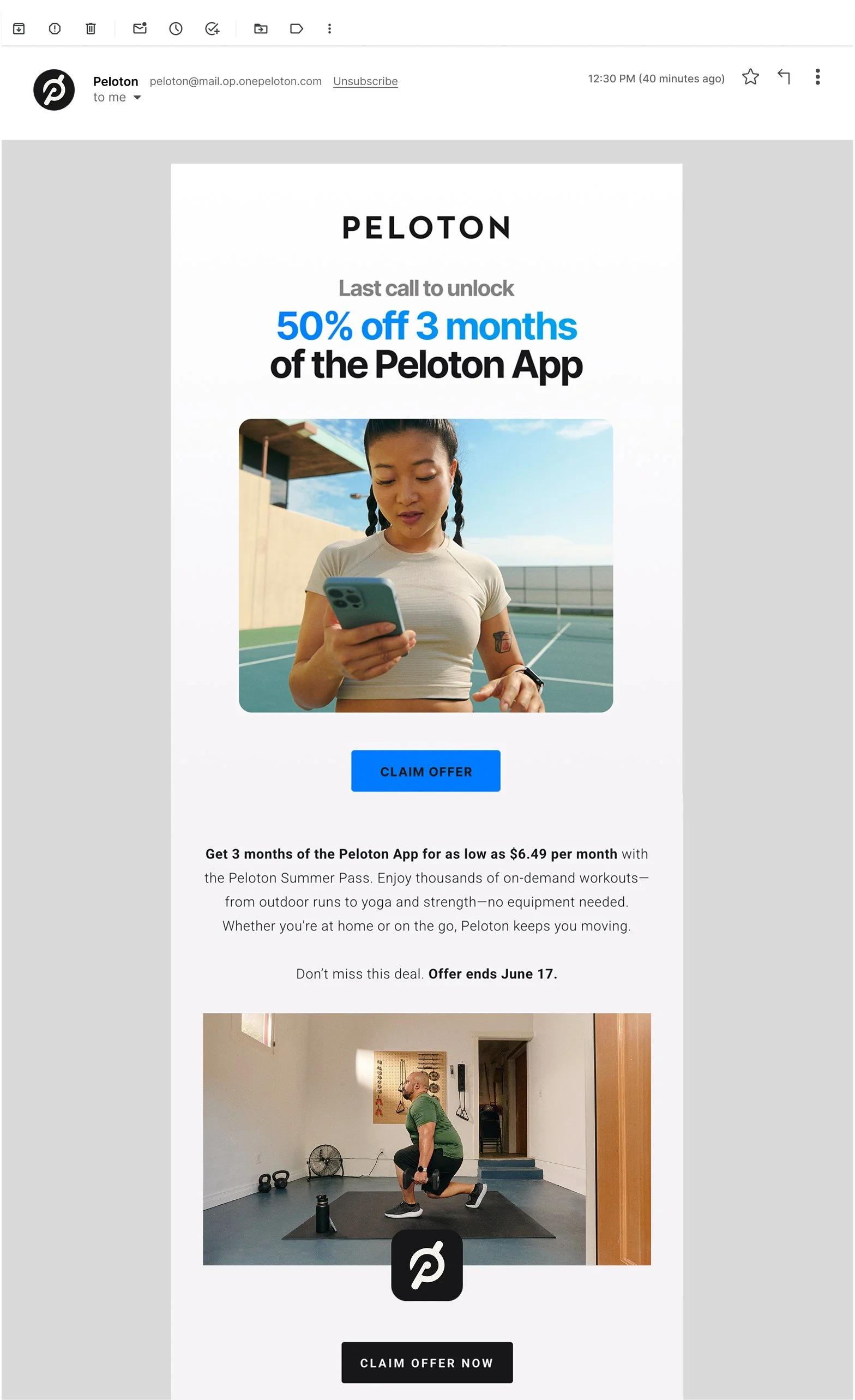
Lifecycle
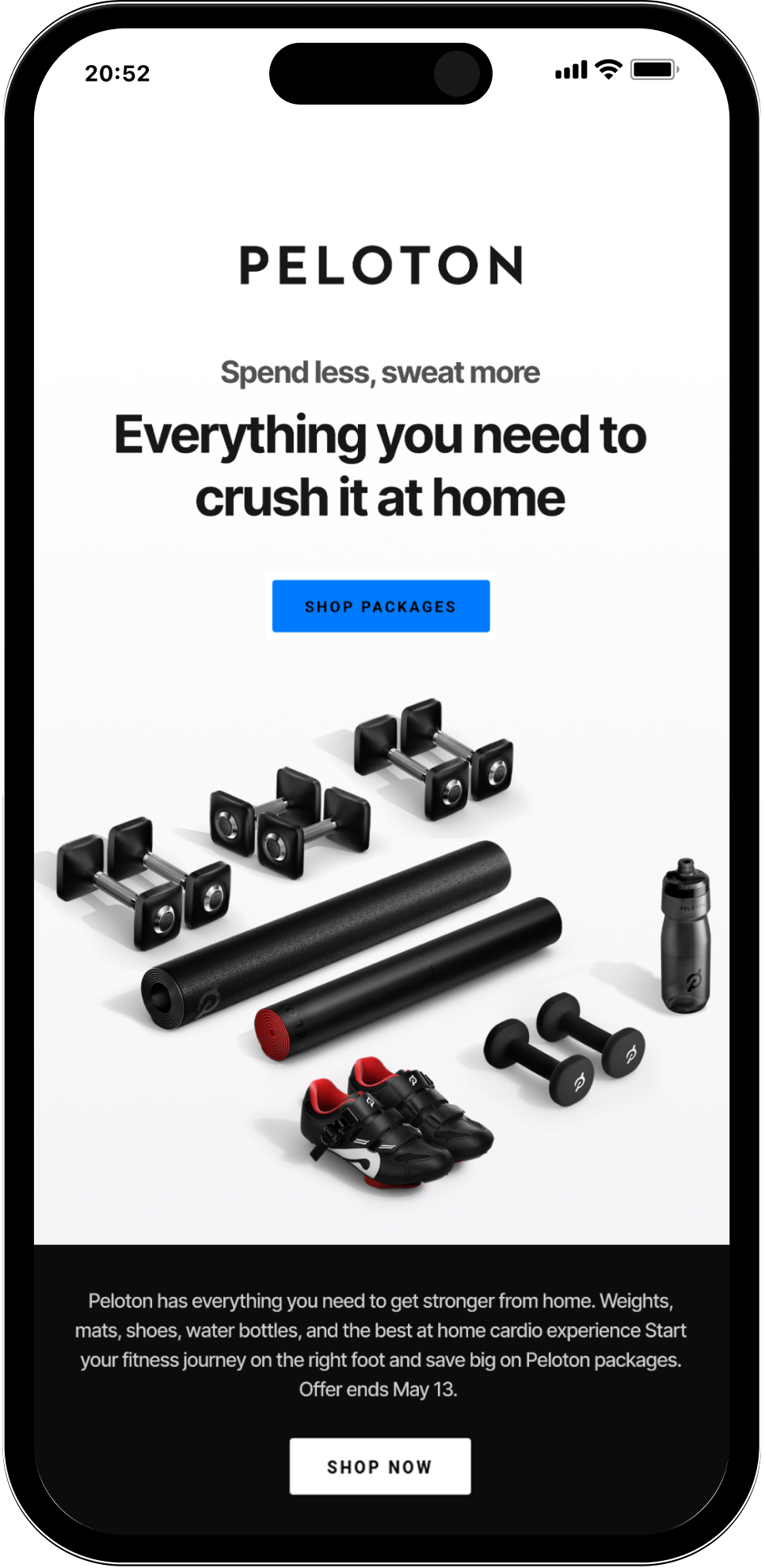
Display
Peloton
The secret to a marvellous life
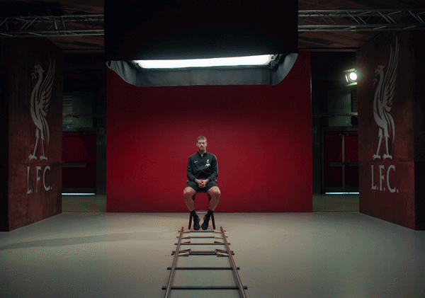
Peloton x Liverpool
Goals. Anytime. Anywhere.
Peloton
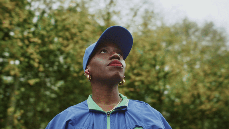
Moved by discipline: Candice Brathwaite

Peloton x German National League
Ever loved something so much?